

Client
MY ROLE
MY ROLE
Product Strategy • UX Research Synthesis • Information Architecture • Data Visualization • UI Design • Design System • Engineering Handoff
saas platform redesign
REDESIGNING a Fragmented SaaS Platform Into a Cohesive Product Experience

Transforming Qwoted's fragmented SaaS platform into a cohesive product experience
As Head of Design at Qwoted, I led the redesign of the platform's core experience and built the company's first design system to help the product scale.
MY ROLE
When I joined Qwoted, the company had already built a product people wanted. What hadn't kept pace was the experience of using it.
Qwoted connects journalists searching for expert commentary with the sources who can provide it. It's a two-sided marketplace where trust and speed both matter.
As new features shipped to meet growing demand, the interface accumulated inconsistency faster than anyone could reconcile it.
Navigation patterns differed screen to screen.
Onboarding created friction before it created value.
Engineering was spending more time interpreting design intent than building it.
To begin, I ran a full product audit. I mapped out where the experience was working against the users it served, and where it was working against them.
Some screenshots from the audit can be found below


Instead of solving isolated problems, every decision had to support four principles:
Reduce cognitive load
Build consistency
Increase trust
Design for future scale
Building the foundation: creating Qwoted's first design system
Instead of treating the design system as a collection of reusable components, I built it as the product's single source of truth.
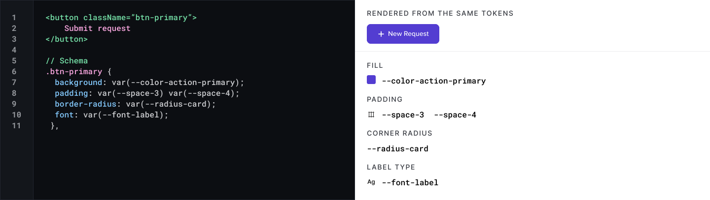
Every design decision was structured around variables, semantic tokens, and reusable component architecture so that the design system directly reflected how the product was built in code.
Since the app was already coded, I centered the Design System variables and tokens around what already existed in the code base (just with some updates for consistency).
0%
0%
Faster dev cycles
The design system enabled me and the engineering team to work together seamlessly and efficiently going forward.
Grounding the redesign in user feedback
I led the user interview process myself, putting working prototypes in front of real Qwoted users rather than asking about the current experience in the abstract. That gave the team feedback grounded in an actual flow: where people hesitated, what they misread, what they expected to happen next. It also meant every principle from the audit (reduce cognitive load, build consistency, increase trust) was tested against real behavior before it shipped.
Method 1: Prototype-led user interviews
I spent months speaking with dedicated Qwoted users who had plenty of feedback on how to improve our platform. It was a great way to help us prioritize what to tackle first, where to dedicate dev time, and what to plan for our sprints.
Method 2: Cross-functional workshops
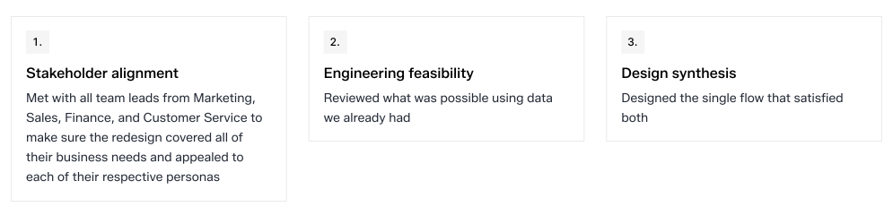
The Source Request form had a problem user interviews alone couldn't fix: Sales, Marketing, and other teams each had their own approach to guiding users through it, with no shared logic behind any of them. I ran internal workshops to bring those teams into the same room, surface where their approaches conflicted, and align on a single way of guiding users to complete the form. The workshop mattered as much as the interviews, it meant the redesign reflected how the whole organization needed the form to work, not just what one team preferred.
The highest-leverage product opportunities
There were many wins during my time at Qwoted, but these are certainly the most notable of them:
Reimagining onboarding
PROBLEM
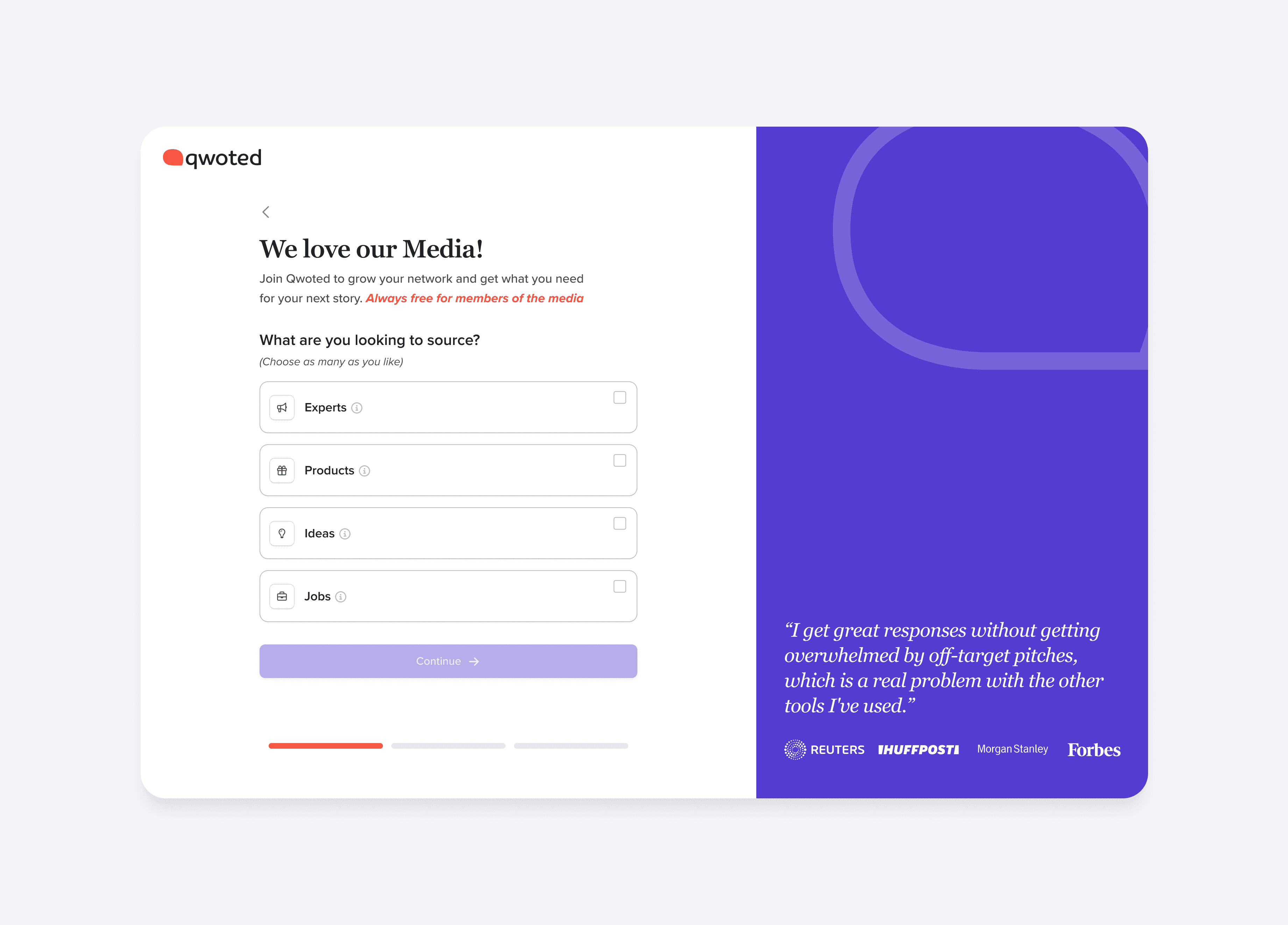
Users needed to understand Qwoted's value immediately, but the existing flow asked for significant setup effort before demonstrating any payoff.
DESIGN PROCESS
There were many moving parts and iterations in this redesign. Here are the highlights of the process.
MAPPING OUT THE JOURNEY
I spent time creating user journey maps to see how a user moved through the onboarding process.

THE SOLUTION
I spent time creating user journey maps to see how a user moved through the onboarding process.
Redesigning source requests
PROBLEM
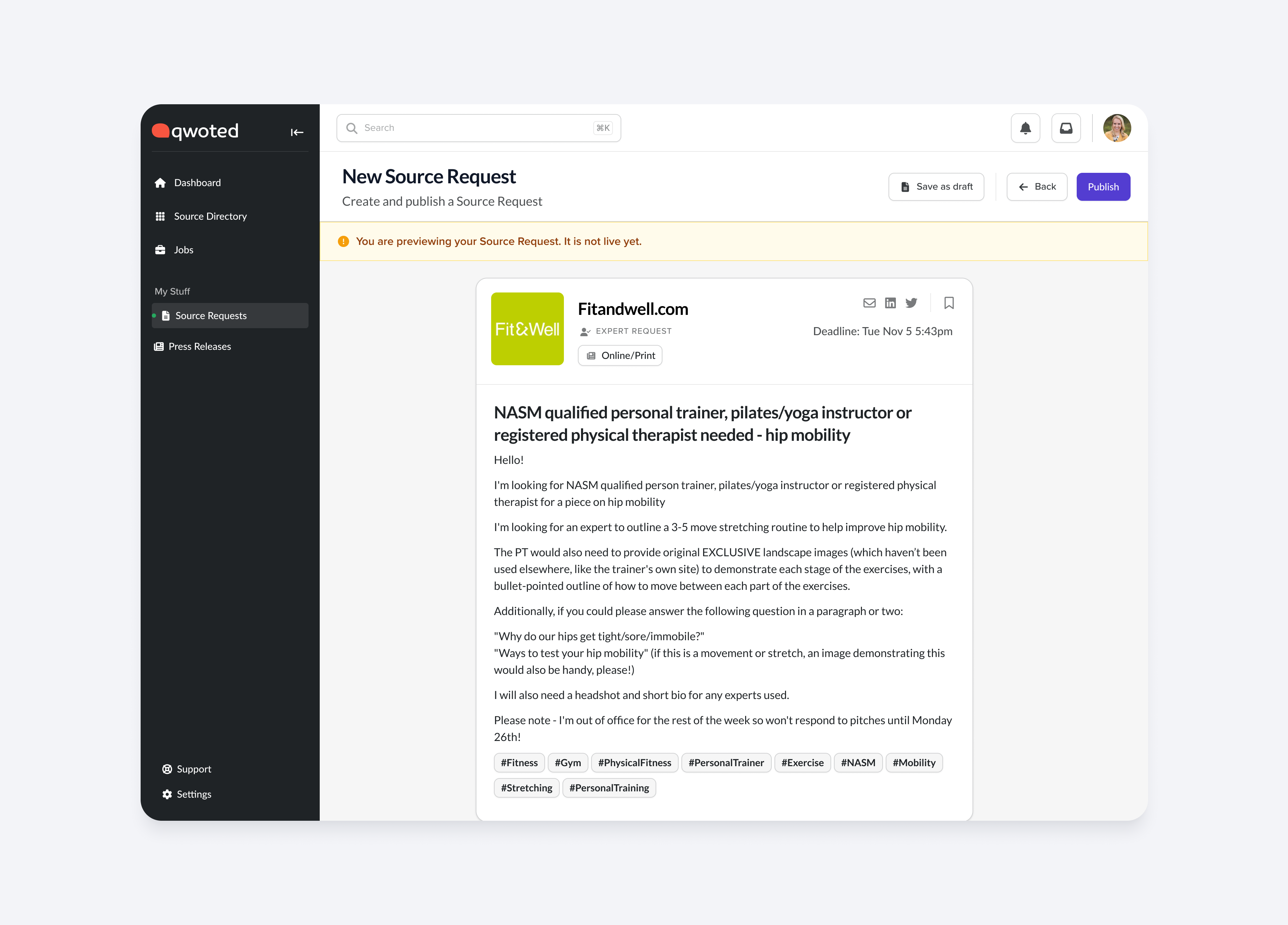
This workflow is the core value exchange of the platform, yet it required users to process large amounts of information with little visual organization.
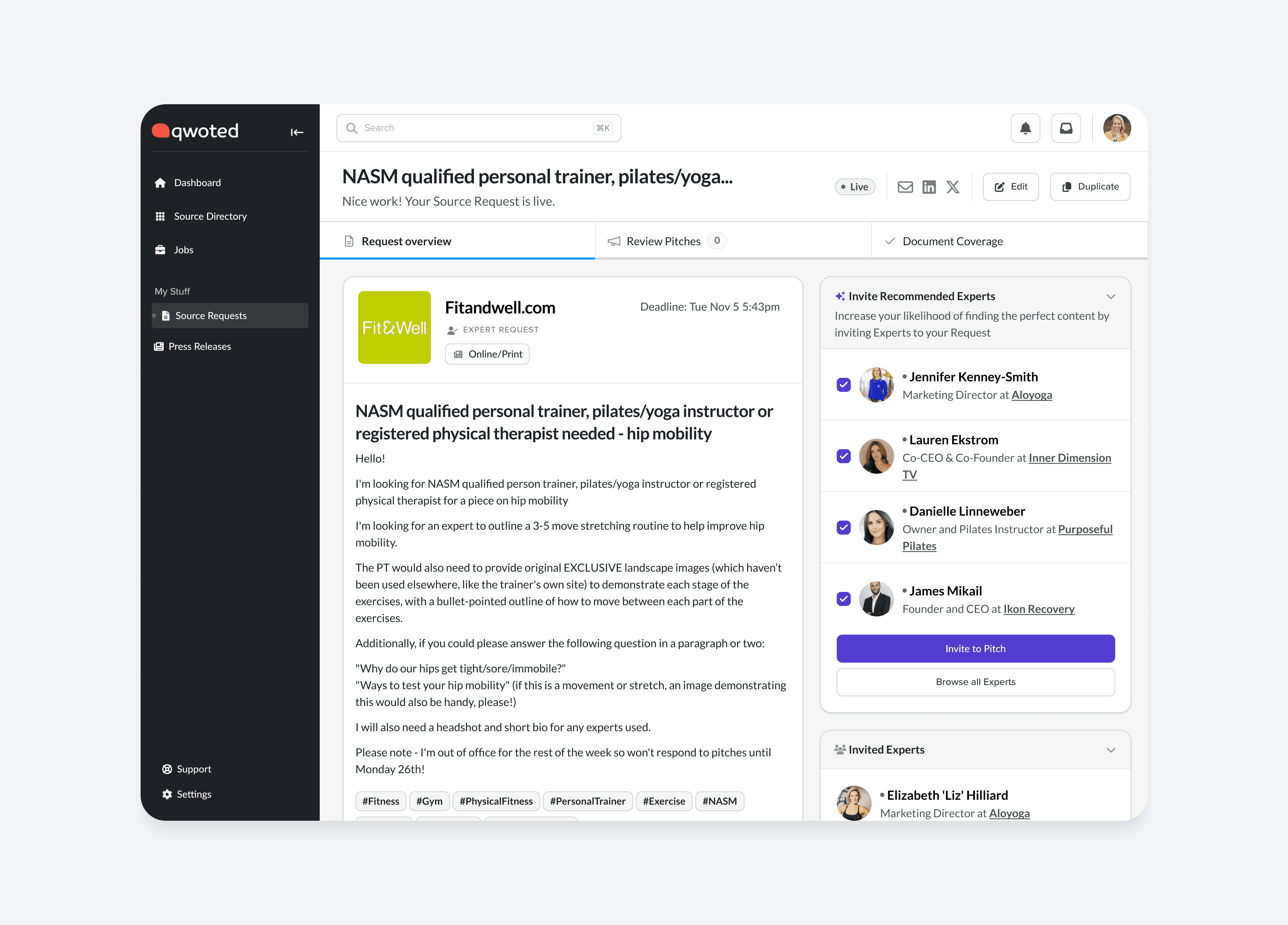
DESIGN PROCESS
There were many moving parts and iterations in this redesign. Here are the highlights of the process.

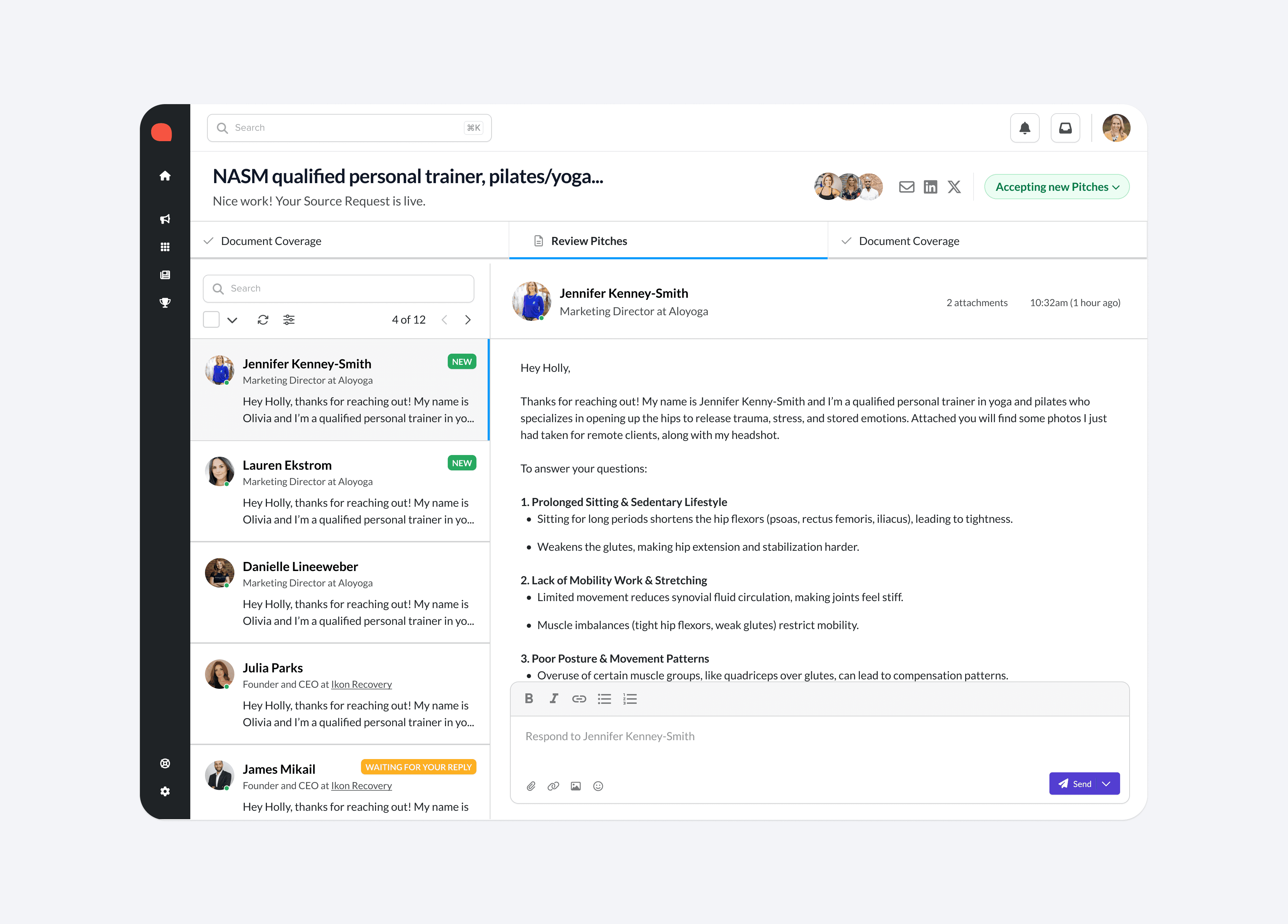
An AI generated system that allows helped automatically match relevant sources to journalists, enabling more activity from both the journalist and expert.

THE SOLUTION
I spent time creating user journey maps to see how a user moved through the onboarding process.
Reinventing expert profiles
PROBLEM
Profiles had been pretty static and straight forward - a name, a bio, a few tags. But an expert profile is a journalist's first (and sometimes only) basis for trust. I rebuilt it as a professional media hub: richer hierarchy, credibility signals, story ideas, media highlights, and calls to action built for the person making the decision on the other end.

Designing across the entire ecosystem
The individual pieces mattered less than how they connected. Every flow fed the next, and the design system tied all of it together underneath.

Onboarding fed the dashboard. The dashboard surfaced Source Requests. Source Requests pointed to Expert Profiles. Profiles connected back to Managed Services for the requests that needed a human touch. None of it worked as a single screen, it worked as a system, which is exactly why the design system had to come first.
Working cross-functionally
None of this shipped from a design file in isolation. Every decision was negotiated, prioritized, and stress-tested with the people who'd own it after launch.

Results
Not just a shipped redesign, but a shift in how the product, the team, and the organization operated afterward.
PRODUCT
More consistent user experience
Reduced onboarding friction
Clearer navigation
Stronger engagement
ENGINEERING
Reusable components
Better implementation consistency
Faster handoffs, fewer redos
ORGANIZATION
Shared design language
Better cross-team collaboration
Faster feature development
A foundation for future growth