

Client
MY ROLE
MY ROLE
Product Strategy • UX Research Synthesis • Information Architecture • Data Visualization • UI Design • Design System • Engineering Handoff
saas platform redesign
REDESIGNING a Fragmented SaaS Platform Into a Cohesive Product Experience

Transforming a Qwoted's fragmented SaaS platform into a cohesive product experience
As Head of Design at Qwoted, I led the redesign of the platform's core experience and built the company's first design system to help the product scale.
MY ROLE
When I joined Qwoted, the company had already built a product people wanted. What hadn't kept pace was the experience of using it.
Qwoted connects journalists searching for expert commentary with the sources who can provide it. It's a two-sided marketplace where trust and speed both matter.
As new features shipped to meet growing demand, the interface accumulated inconsistency faster than anyone could reconcile it.
Navigation patterns differed screen to screen.
Onboarding created friction before it created value.
Engineering was spending more time interpreting design intent than building it.
Defining the overall UX strategy
Translating research into interaction patterns
Reorganizing the information architecture
Designing new data visualizations
Building a reusable design system
Working closely with engineering to bring the product into production
When I first started, I ran a full product audit. I mapped out where the experience was working against the users it served, and where it was working against them.
Some screenshots from the audit can be found below


Instead of solving isolated problems, every decision had to support four principles:
Reduce cognitive load
Build consistency
Increase trust
Design for future scale
Building the foundation: creating Qwoted's first design system
Instead of treating the design system as a collection of reusable components, I built it as the product's single source of truth.
Every design decision was structured around variables, semantic tokens, and reusable component architecture so that the design system directly reflected how the product was built in code.
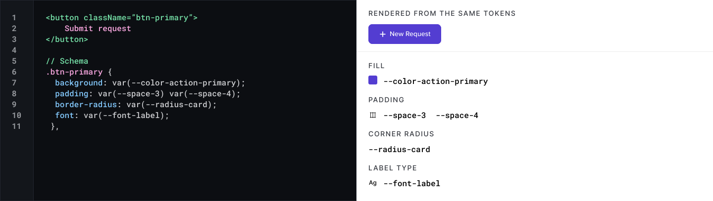
Since the app was already coded, I centered the Design System variables and tokens around what already existed in the code base (just with some updates for consistency).
0%
0%
Faster dev cycles
The design system enabled me and the engineering team to work together seamlessly and efficiently going forward.
DESIGN PRINCIPLES
These principles became the north star for every design decision.
Every page should answer:
"What happened?"
"Why did it happen?"
"What should I do next?"
Progressively disclose complexity.
Advanced information should exist but only when users need it.
Design for scanning
Users should understand dashboard health within seconds.
Prioritize action over analysis
The interface shouldn't simply present data. It should support better decisions.
Information Architecture
One of the biggest parts of this redesign was restructuring the way the data flowed through the product.
This is the end result of MULTIPLE iterations (probably around 10 iterations of this IA)

Data Visualization Strategy
Rather than adding more charts, I focused on reducing cognitive effort. I redesigned every visualization using a hierarchy of questions.
First, what needs my attention?
Second, why?
Third, where can I investigate further?
Enterprise Overview
“What requires my attention?”
Portfolio
“Where is the problem?”
Supplier
“What is causing the problem?”
Node
“What action should I take?”
Recommended Actions
“What do I do next?”
Collaboration
This project required balancing priorities across multiple departments.
The Regional Dashboard gives the user a more narrowed view of all stores within a specific region.
Multiple Business Leaders/Stakeholders
Each stakeholder had their own agenda they wanted to achieve with this dashboard, so I had to meet all of their individual business needs while advocating for the user (the employee) the whole time.
Researchers
The UX researchers were very heavy into the data and advocating for optimal usability and fitting in as much data as possible.
Engineering
I had to collaborate with engineering who were very focused on feasibility. Since I was a developer before I was a designer, I could easily speak their language and design within their constraints so there were no compromises to be made.
Results
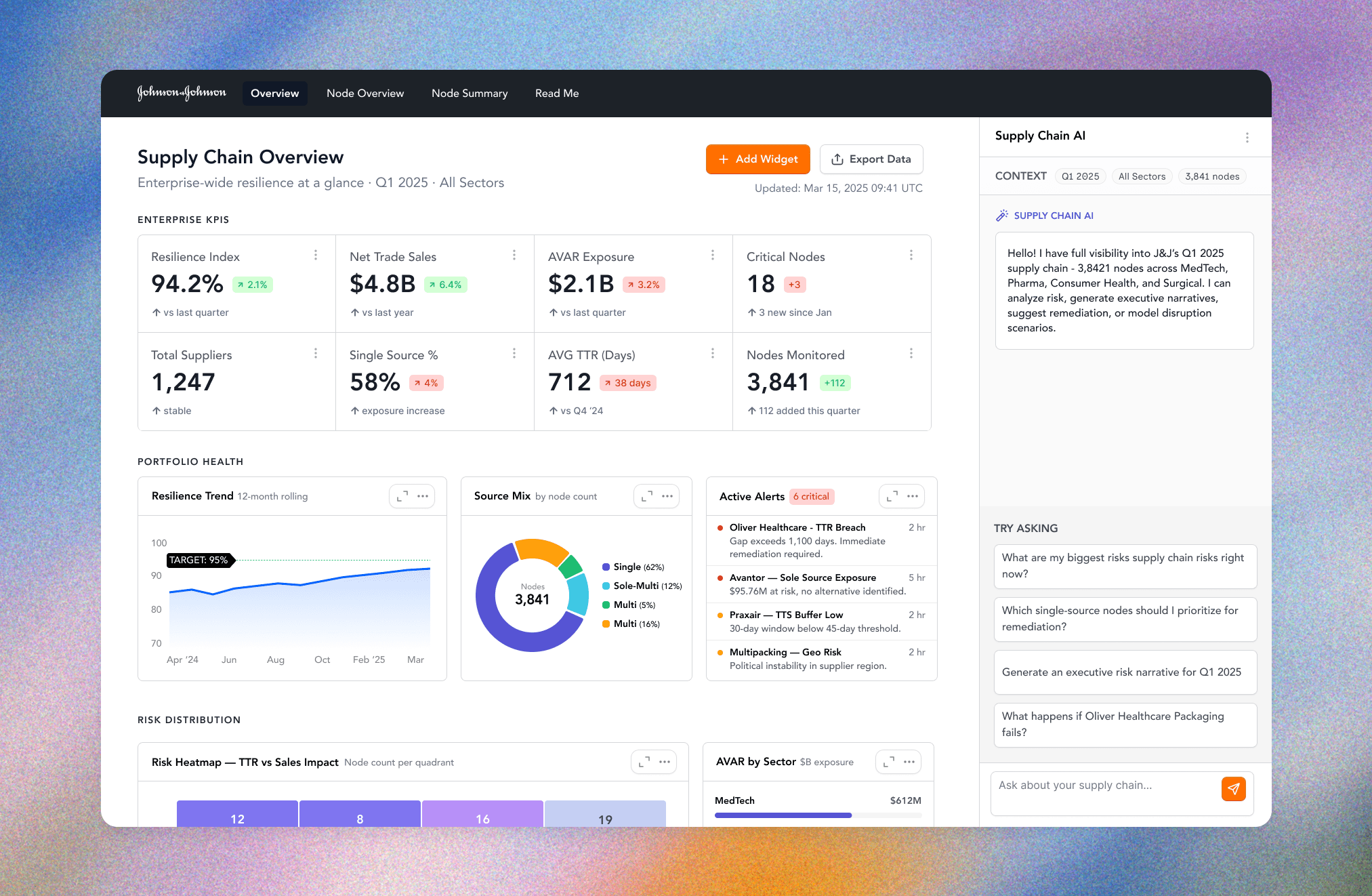
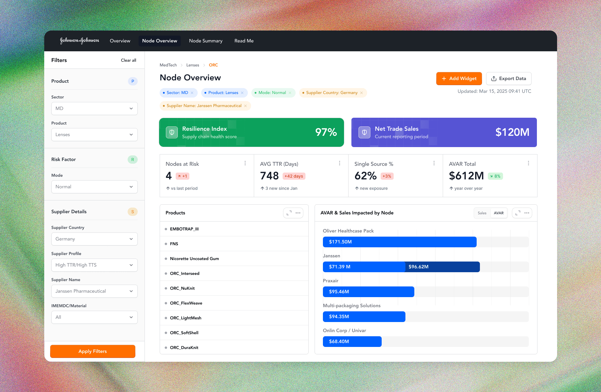
Within months of launch, dashboard adoption increased dramatically.
The dashboard became the primary interface for understanding supply chain performance rather than another reporting destination.

0%
0%
of employees
Who had previously stopped using the dashboard returned to it as part of their daily workflow.
0+
0+
Business Metrics Organized
Transforming fragmented operational, customer, and marketing data into a single decision-making platform.
Reflection
Looking back, this project fundamentally changed how I approach enterprise product design.
The hardest problems rarely involve creating better interfaces.
They're about simplifying complexity without removing capability.
It reinforced that successful data products aren't built by adding more information, but rather by helping people understand the right information at exactly the right moment.