

Client
MY ROLE
MY ROLE
Product Strategy • UX Research Synthesis • Information Architecture • Data Visualization • UI Design • Design System • Engineering Handoff
supply chain dashboard redesign
redesigning an internal dashboard tool for non-technical users

Transforming Johnson & Johnson's internal supply chain platform into a decision-first experience for non-technical employees
THe core product problem
The Problem
The existing Tableau dashboard contained the right data, but it wasn't designed for the people who needed to make decisions with it. Non-technical employees struggled to interpret dense reports, navigate dozens of filters, and identify which risks required immediate attention. As a result, dashboard adoption declined and many teams returned to spreadsheets and manual reporting.
Information overload
Users were presented with dozens of tables, charts, and metrics simultaneously, making it difficult to distinguish critical signals from supporting information.
Built for analysts, not operators
The dashboard assumed deep supply chain knowledge and Tableau expertise, creating unnecessary friction for employees whose primary job wasn't data analysis.
No clear path to action
Users could identify that something had changed, but not why it mattered or what they should do next. Important insights were buried beneath layers of reports and disconnected visualizations.

"I spend more time finding the information than actually using it."
MY ROLE
As the Lead Product Designer, I was responsible for the end-to-end product experience.
This included:
Defining the overall UX strategy
Translating research into interaction patterns
Reorganizing the information architecture
Designing new data visualizations
Building a reusable design system
Working closely with engineering to bring the product into production
Working alongside our UX researcher, I synthesized interview findings, usability observations, and persona research to identify recurring behavioral patterns.
Information Overload
Nearly every dashboard attempted to answer every possible question at once. Users couldn't distinguish important information from supporting information.
Technical Language
Charts assumed users already understood supply chain terminology. For many employees, this created unnecessary cognitive load before they could even begin interpreting the data.
No Visual Hierarchy
Everything looked equally important. Critical KPIs were visually competing against secondary metrics.
Slow Navigation
Finding answers often required opening multiple reports and filtering through several layers of data. Instead of supporting quick decisions, the dashboard encouraged hunting.
Performance Issues
The original Tableau implementation loaded large amounts of information simultaneously, resulting in long wait times before users could interact with the dashboard.
Defining Success
Increase dashboard adoption
Reduce time required to locate critical information
Make complex supply chain data understandable for non-technical employees
Create consistency across future reporting experiences
Reduce reliance on manual reporting workflows
The engineering team had already built a functional Tableau prototype capable of surfacing hundreds of supply chain metrics.
Technically, it worked. Practically, it didn't.


DESIGN PRINCIPLES
These principles became the north star for every design decision.
Every page should answer:
"What happened?"
"Why did it happen?"
"What should I do next?"
Progressively disclose complexity.
Advanced information should exist but only when users need it.
Design for scanning
Users should understand dashboard health within seconds.
Prioritize action over analysis
The interface shouldn't simply present data. It should support better decisions.
Information Architecture
One of the biggest parts of this redesign was restructuring the way the data flowed through the product.
This is the end result of MULTIPLE iterations (probably around 10 iterations of this IA)

Data Visualization Strategy
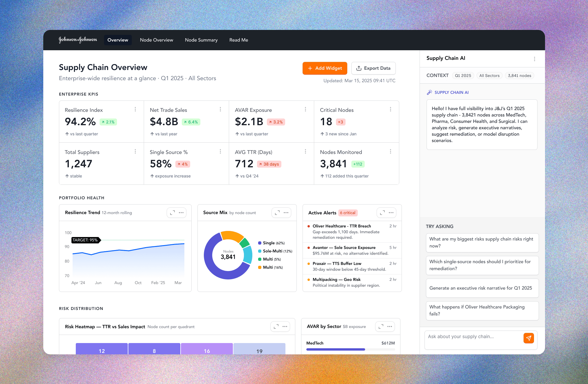
Rather than adding more charts, I focused on reducing cognitive effort. I redesigned every visualization using a hierarchy of questions.
First, what needs my attention?
Second, why?
Third, where can I investigate further?
Enterprise Overview
“What requires my attention?”
Portfolio
“Where is the problem?”
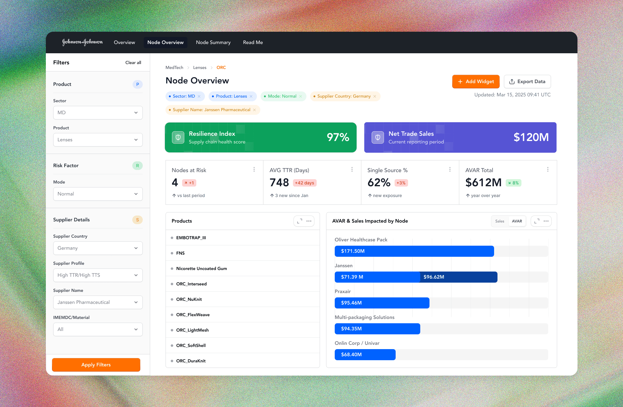
Supplier
“What is causing the problem?”
Node
“What action should I take?”
Recommended Actions
“What do I do next?”
Collaboration
This project required balancing priorities across multiple departments.
The Regional Dashboard gives the user a more narrowed view of all stores within a specific region.
Multiple Business Leaders/Stakeholders
Each stakeholder had their own agenda they wanted to achieve with this dashboard, so I had to meet all of their individual business needs while advocating for the user (the employee) the whole time.
Researchers
The UX researchers were very heavy into the data and advocating for optimal usability and fitting in as much data as possible.
Engineering
I had to collaborate with engineering who were very focused on feasibility. Since I was a developer before I was a designer, I could easily speak their language and design within their constraints so there were no compromises to be made.
Results
Within months of launch, dashboard adoption increased dramatically.
The dashboard became the primary interface for understanding supply chain performance rather than another reporting destination.

0%
0%
of employees
Who had previously stopped using the dashboard returned to it as part of their daily workflow.
0+
0+
Business Metrics Organized
Transforming fragmented operational, customer, and marketing data into a single decision-making platform.
Reflection
Looking back, this project fundamentally changed how I approach enterprise product design.
The hardest problems rarely involve creating better interfaces.
They're about simplifying complexity without removing capability.
It reinforced that successful data products aren't built by adding more information, but rather by helping people understand the right information at exactly the right moment.