Role
Team
Head of Design, 6 Developers
Tools


Industry
EXECUTIVE SUMMARY
As Head of Design at Qwoted, I led the end-to-end redesign of the platform's core experience, transforming a fragmented product into a cohesive, user-centered ecosystem. I shipped the company's first design system (V1), enabling scalable, consistent UI/UX across the board. Collaborating closely with Product, Engineering, and Customer Success, I ensured every design decision aligned with business goals.
When I joined, the platform had strong potential but suffered from inconsistent patterns, unclear flows, and usability challenges. My mission was to bring clarity, cohesion, and delight to the experience - and I delivered, fast.

Here is a look into the most impactful redesigns that I led throughout my time at Qwoted
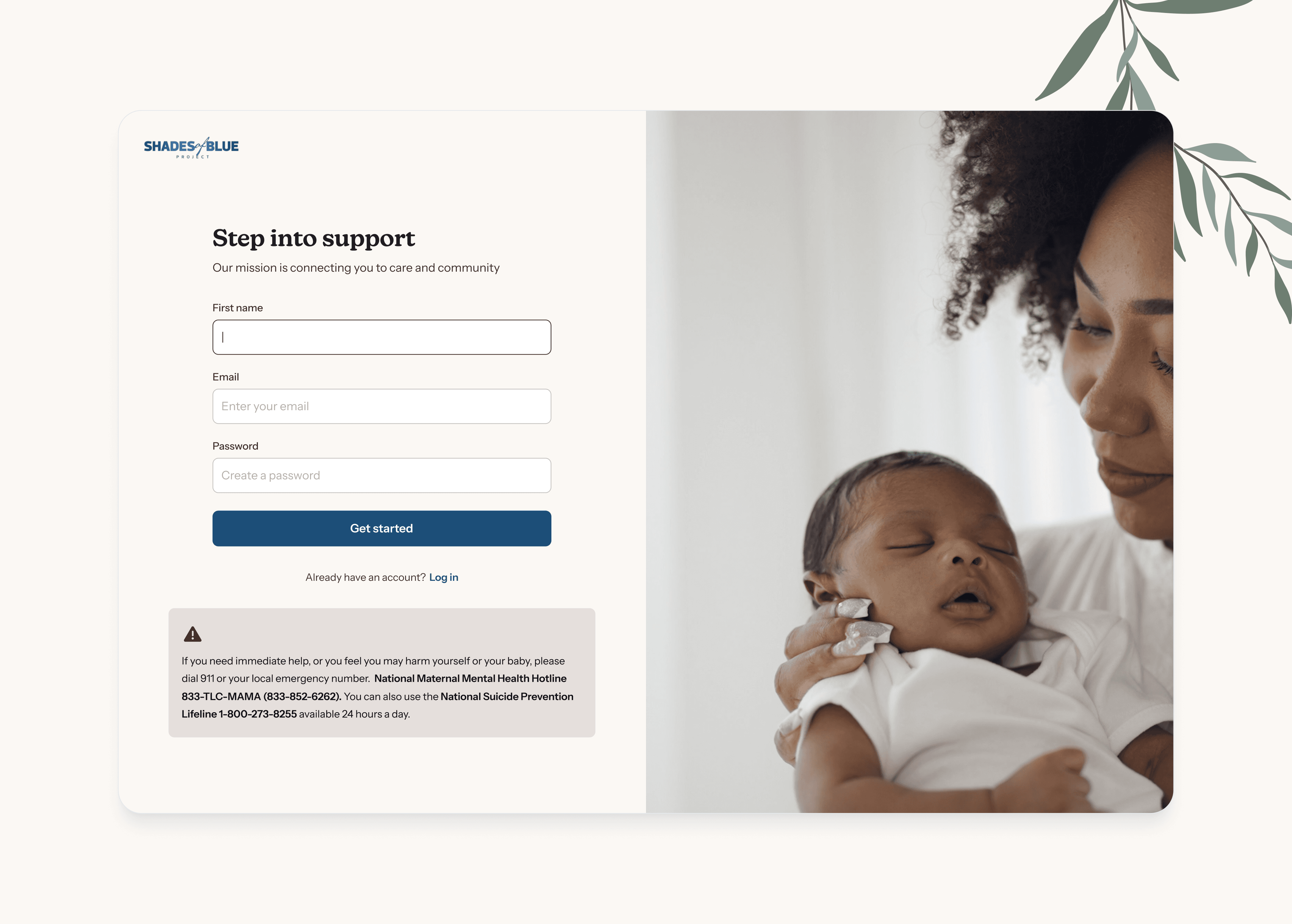
Onboarding Flow
The original onboarding experience was one-size-fits-all and confusing. I redesigned it from the ground up — tailoring it to each user type, improving clarity, and dramatically reducing drop-off.
Before
What Wasn't Working
Overwhelming interface with no clear direction
No curation for individual user personas
Even though there are 3 different kinds of user profiles
No perceived value before signing up
Platform's value is hidden behind sign up page
High drop-off before completing profile setup
High Customer Service tickets to fix incorrectly set up profiles
Due to poor guidance during onboarding
Outdated aesthetics
After
How I Fixed It
Introduced a role-based onboarding path (Journalist vs. Source)
Simplified the UI using progressive disclosure to more efficiently guide users
Added contextual tips to clarify platform value as users progressed
Clear visual hierarchy, progress indicators, and a warm, brand-aligned tone
Automated profile creation to lessen Customer Service manual lift

Source Request Forms
The Source Request forms were static and outdated, and needed to be redesigned with the user at the forefront.
Before

What Wasn't Working
Too many options that users weren't selecting (i.e. Products, Speakers)
Not enough customization
Wasn't leveraging AI for smart suggestions, etc.
Static, not much functionality besides just posting
Overall lacking on user requests for other features
During the Redesign: Creating Form Variants & User Testing
How the Redesign Worked
In order to truly understand what users wanted in the new form, I spoke to real users who used the form on a daily basis. From there, I created 3 different variants of the form. I then circled back to those users and asked them to walk through each variant and provide their thoughts/feelings about each one.
✨ After
Adding practical functionality
The form was missing lots of basic functionality that users would expect to see when publishing long-form content. I added in a Save as Draft function along with a Review Before Publishing function for better form control.


Leveraging AI
One of my favorite ideas that I added to the form was the "Invite Recommended Experts". The platform would pull relevant Experts based on the content in the Source Request and nudge users to Invite them to Pitch on the Request. Users loved this idea!
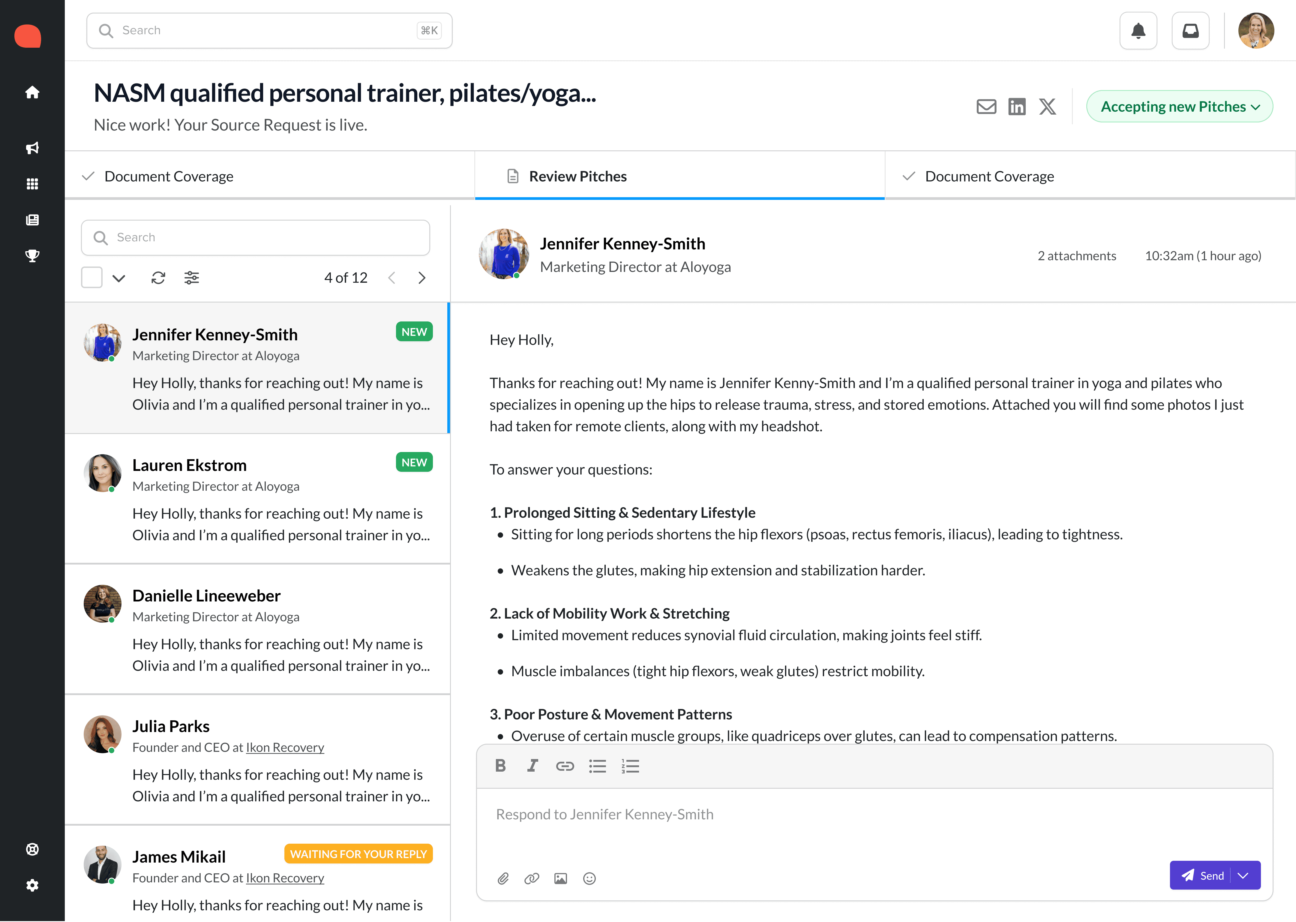
How I Fixed It
Consolidated options to only two of the most common selections
Added in more functionality for users
Utilized AI to provide Recommended Experts
Clear process of what comes after submitting the Source Request
More dynamic form that shows progress over time as user fills it out


WSJ

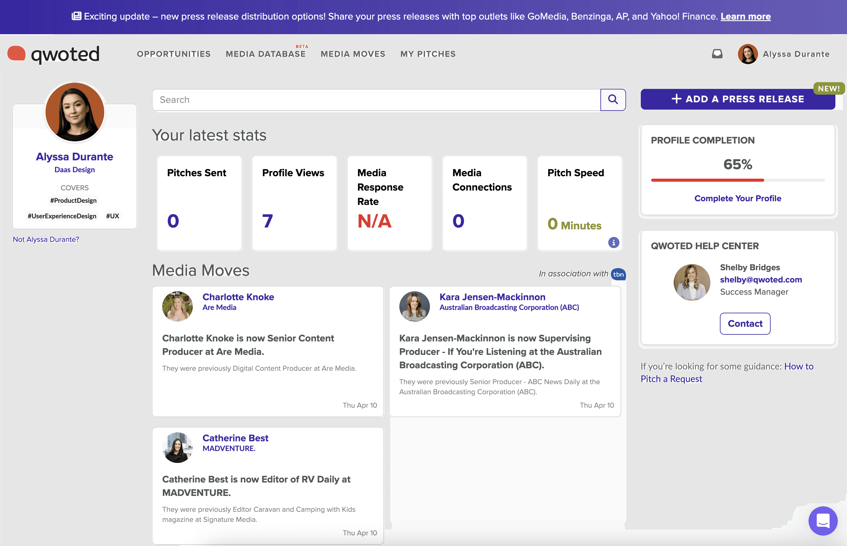
Dashboard Transformation: From Utility to Community
The original dashboard was functional but uninspiring - a static collection of links with no incentive to return. I redesigned it into a personalized, real-time feed to surface relevant activity, drive engagement, and turn Qwoted into a daily-use tool.
Before
What Wasn't Working:
Static list of links with minimal relevance or interactivity
Irrelevant metrics that users didn't perceive as valuable
No prioritization, personalization, or curation
Didn’t reflect the energy or real-time nature of media
Users had no reason to return unless they were actively posting
What Wasn't Working
Too many options that users weren't selecting (i.e. Products, Speakers)
Not enough customization
Wasn't leveraging AI for smart suggestions, etc.
Static, not much functionality besides just posting
Overall lacking on user requests for other features
✨ After
What I Did:
Designed to mimic a social media stream — familiar, scannable, and engaging
Included more relevant, useful metrics for users
Easy to find CTAs
Real time, personalized feed
For PR Professionals, we displayed targeted opportunities that matched with their expertise. For Media, we displayed relevant information about their Requests.
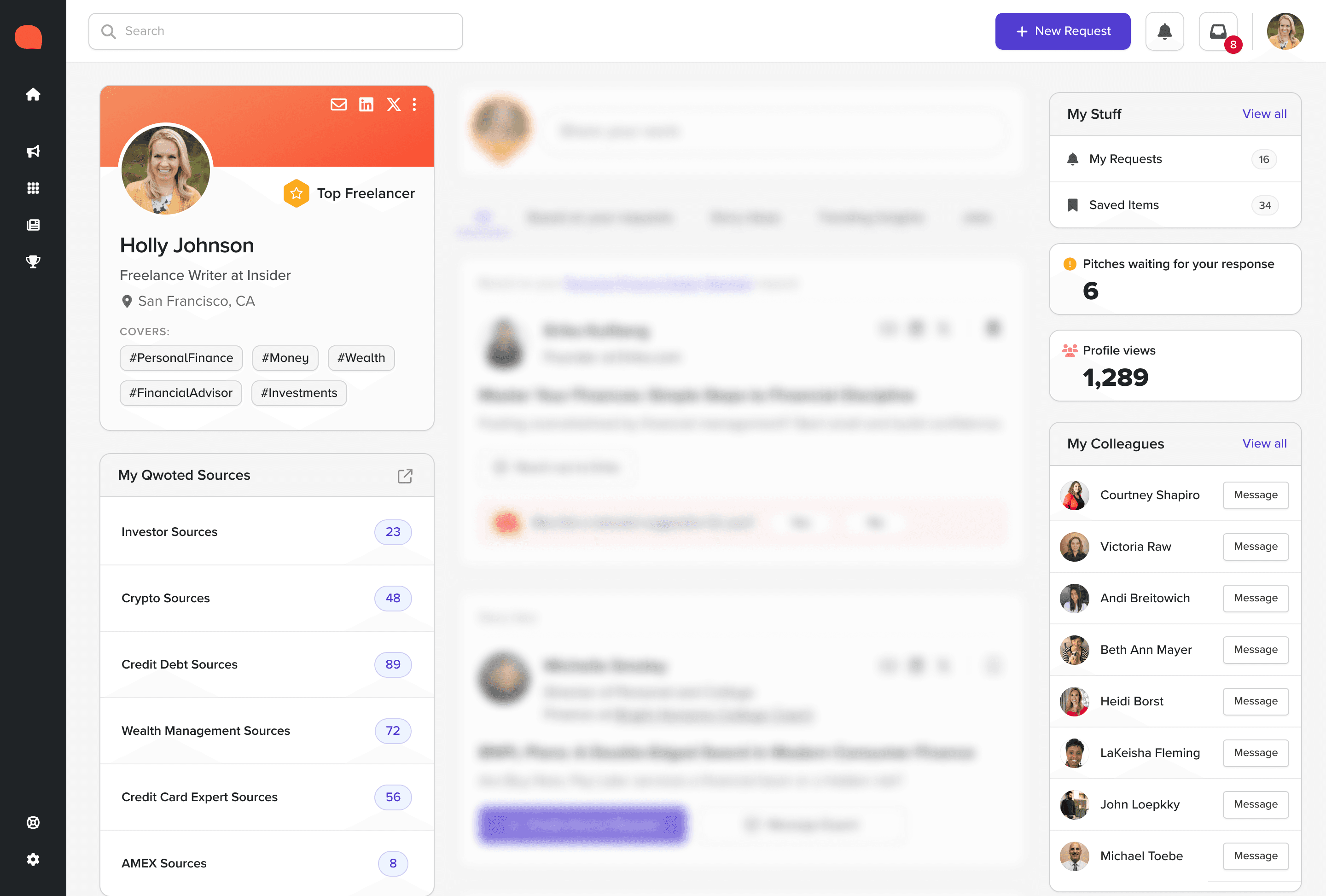
Easily accessible data sources
Unlike the previous dashboard, the Feed shows all the necessary information a user may need while navigating the app, all in one place.
Modular, scalable artifact system
Using the design system for consistency, I created a library of artifacts for PR, Expert, and Media users that were scalable in nature and could expand to fit every phase of Qwoted's growth.

Forbes
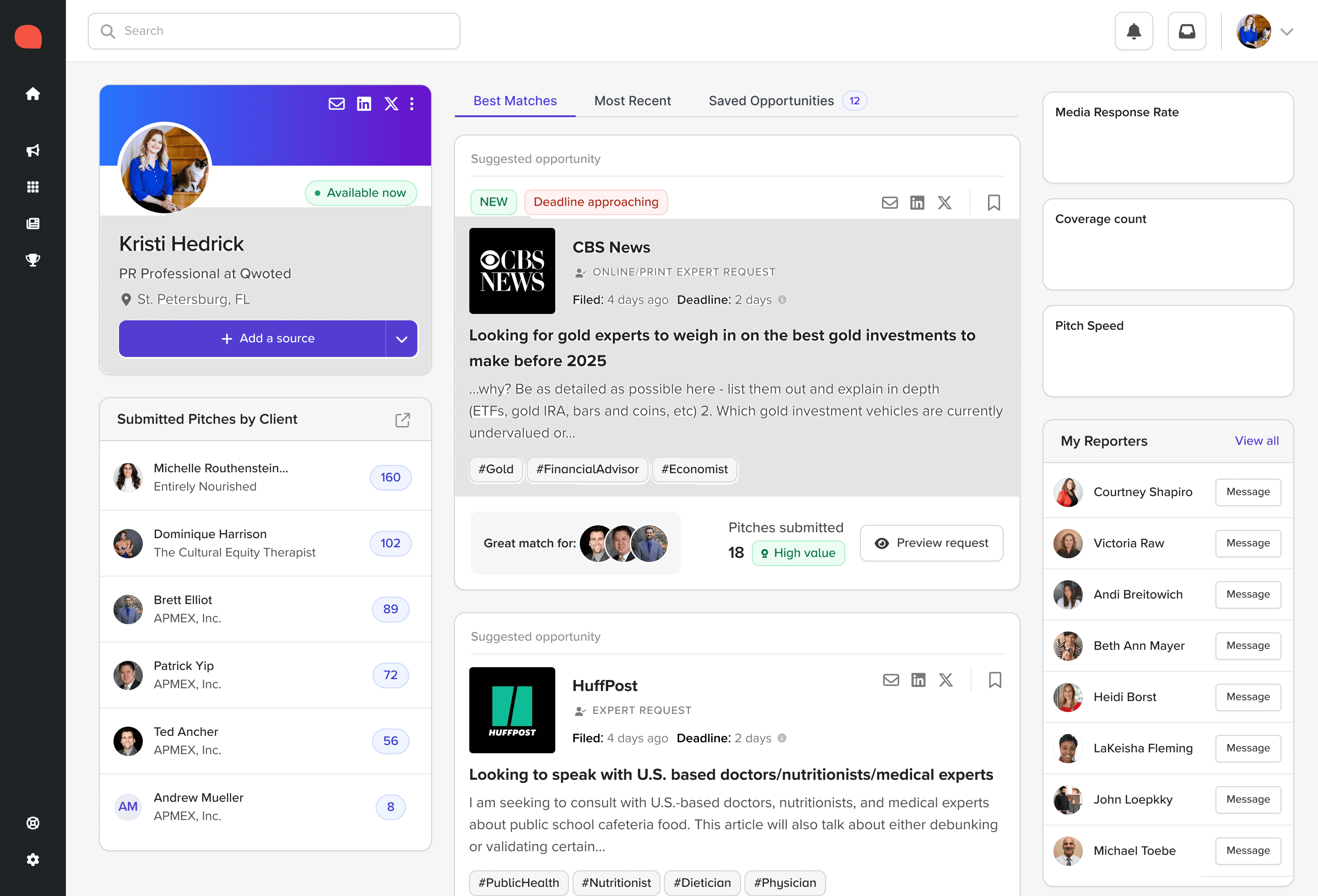
User Profiles
The current user profiles (across all personas - Media, PR, and Expert), were not very cohesive or linear. They didn't tell a story or promote/market our users in any way. That's where I came in. I used existing mental models that already existed around profiles and leveraged those to design a more "SaaS-like" feel to them.
Before
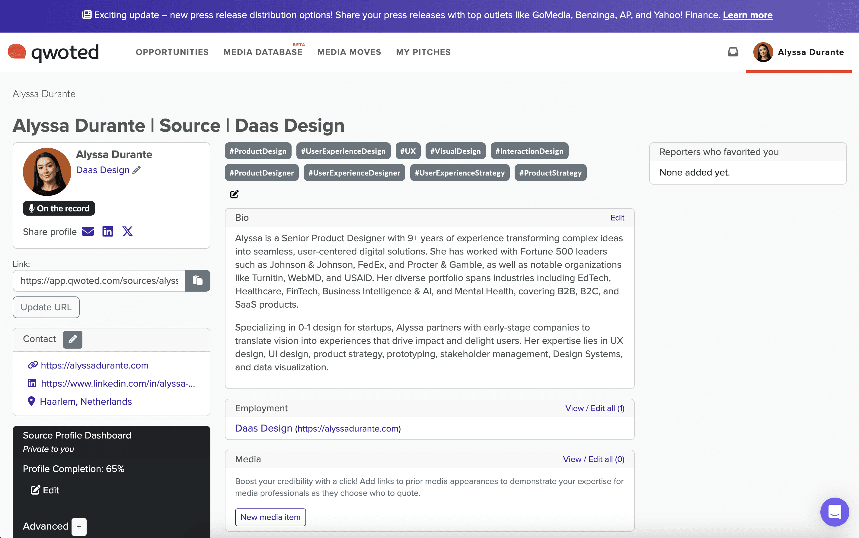
What Wasn't Working:
Form-like layout lacking visual rhythm or emotional impact
Tags, bio, and contact info stacked with no clear grouping
Weak hierarchy and minimal use of media or social proof
Difficult to scan for journalists looking for story angles or credibility markers
No incentives for the user to continue filling out their profile
✨ After
What I Did:
Shifted from form-based thinking to personal brand storytelling
Gave users the tools to pitch themselves visually with confidence
Structured content to match journalists’ mental model: fast scan, quick credibility check, and media relevance

NerdWallet