Improving the Usability of a Supply Chain Dashboard

Role
Team
UX Designer, 1 Project Manager, 2 Developers
Tools


Industry
Overview
Johnson & Johnson's Supply Chain team was looking to re-vamp their internal Supply Chain Dashboard. Since Supply Chain itself comes with complex analytics, they wanted a Dashboard that was easy to digest, present, and export information.
The Problem


Goals & Metrics for Success
Optimize the Data
Optimize the data visualization to be easily scannable / digested
Reduce Friction
Decrease the amount of time it takes for a user to find their data
Reintroduce to Workflow
Improve enough so that managers are incorporating it back into their day-to-day workflows
The Outcome
Less time for a user to access a specific data point
Of managers are incorporating the platform back into their daily workflow
Of users agreed that the new navigation is significantly easier to use
88%
Increase in workflow since incorporating the platform back into daily workflow
Talking to Users
I spoke with 5 product managers who (used to) utilize the dashboard on a daily basis. I watched them interact with the current dashboard first; then asked them to go about their daily workflow. Here are some questions I had asked.
What are the main goals or tasks that you perform on the dashboard?
What are the pain points or challenges you experience while using the current dashboard?
Which features or data on the current dashboard are most important for you to access quickly and easily?
How does the current dashboard fit into your workflow, and are there any gaps or inconsistencies in the process?
Are there any particular user groups or roles that have unique needs or preferences?
Are there any particular trends or changes in the supply chain industry that may impact the scalability of the dashboard?
How Users Responded
Almost unanimously (and unsurprisingly), all users showed high frustration while using the dashboard
100%
Of users said that the dashboard was difficult to navigate
100%
Of people were unable to easily find the data points they needed
80%
Of users said the current dashboard does not fit into their current workflow
User Action
User #1
User #2
User #3
User #4
User #5
Can easily navigate the dashboard
Assess any urgent risk in the supply chain
Easily access necessary data
Easily export specific data points
Adds value to your daily workflow
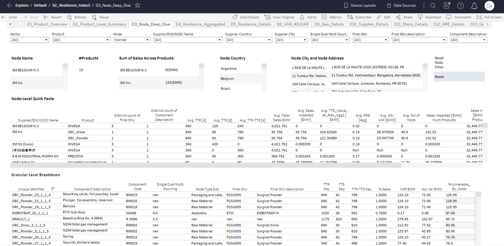
The biggest issue was the Dashboard's navigation. So I started there. I restructured the Information Architecture and introduced a story-telling paradigm for the data.

Improved Navigation Led to Better Data Display & Lighter Code
Instead of endless open tabs like the current dashboard, this design features 4 clickable tabs that show you exactly where you are in the data. You can drill down from each Navigation item. This solution was also much lighter from a tech-debt perspective.

A Clear Entry Point
The current Dashboard did not have a clear Entry Point. It remembered the previous page you were on, which tabs were open, and displayed that information when you opened the app.
The new design features an easy Entry Point page that users can resort to when they want to restart their search for different data journeys.
*Note: Due to an NDA, I can only show example products and example descriptions

The Design team and Stakeholders came to a disagreement over how the Filters should be displayed. To rectify this, I suggested we test the 2 solutions with our users and see which one user's responded more positively to.
I designed both High-Fidelity prototypes to be shown in the user tests
Option 1: Filters on Top
Option 2: Filters Bar on the Side
This project was a great example of how important iteration is in design. There were at least 6 rounds of iterations before the stakeholders considered the design to be in an MVP stage.
Designed a Mini-Design System for Cohesive Data Display & Future Designs


"Alyssa was able to meet aggressive deadlines and complete high-quality work on time"
Alyssa is terrific to work with, friendly, and skilled in multiple areas of UX design and prototype development. It was a pleasure to work with her. She was able to meet aggressive deadlines and complete high-quality work on time.

Susan R.
Design Manager, Johnson & Johnson