How a Design System Improved Handoffs by 30% & Transformed Qwoted's SaaS Platform

Role
Team
Head of Design, 6 Developers
Tools


Industry
EXECUTIVE SUMMARY
Establishing Design Consistency: Developing Qwoted's Design System
As Head of Design at Qwoted, I spearheaded the creation of a comprehensive design system, enhancing UI consistency and streamlining collaboration between design and development teams.
30
%
Reduction in design-to-development handoffs, resulting in faster dev cycles
50
+
Unified UI components, enhancing the platform's visual coherence
95
%
Adoption rate for the Dev team
100
%
Positive feedback from stakeholders for improved workflow and product quality

About Qwoted
Qwoted is a platform that connects media professionals with brands, experts, and small businesses, facilitating efficient communication and collaboration.
My Role
As the Head of Design, I audited the existing platform to address design inconsistencies, the existing Dev-handoff process and evaluated any pain points that the Devs encountered designing new features/components.
The Problem
The platform faced challenges with inconsistent UI elements, leading to a fragmented user experience and inefficiencies in the design-to-development workflow.
Standardization
Standardize UI components to ensure a cohesive user experience
Collaboration
Enhance collaboration between design and development teams
Efficiency
Reduce design and technical debt to accelerate feature development
A Quick Before & After
This shows the incredible impact the Design System had one the Dashboard UI. The Before can be seen as generic and bootstrapped, where the After is custom, built with the brand in mind, and cohesive
The Process
Let's dive into how Qwoted's Design System was born
Platform Audit & Findings
I began by conducting a comprehensive audit of the existing platform and it's UI components, identifying redundancies and inconsistencies along the way and documenting them.

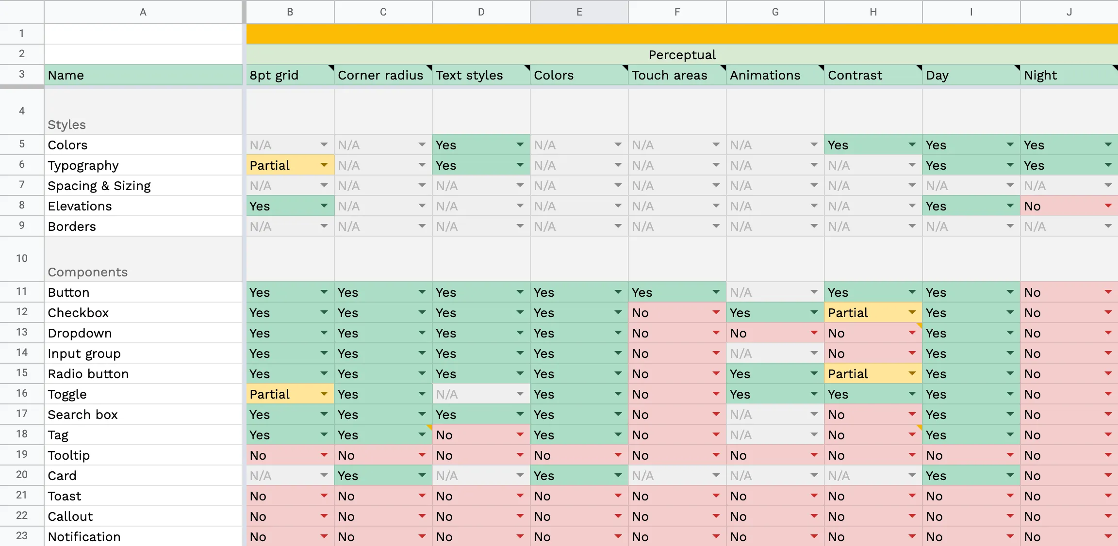
Inconsistent buttons
There were several different kinds of buttons without a pattern
Generic color scheme
The color scheme was not unique to the platform
Random components
There were random components everywhere
Lack of documentation
There was no documentation on when and how to use components
Stakeholder Collabs
Engaged with developers and product managers to understand pain points and gather requirements.

100%
100%
of Leadership agreed they needed a new Design System
100%
of Team Heads wanted a cohesive design

100%
agreement amongst all teams
The Results
Less time for a user to access a specific data point
Of managers are incorporating the platform back into their daily workflow
Of users agreed that the new navigation is significantly easier to use
Of users agreed that the new navigation is significantly easier to use
This project was a great example of how important iteration is in design. There were at least 6 rounds of iterations before the stakeholders considered the design to be in an MVP stage.