Scaling an EdTech startup from
0 to 30,000+ users.
UI/UX Design
0-1 Design
UX for AI
Design Systems
SaaS/B2B/B2C


Pre-seed AI startup
|

USA
Deliverables
Mobile App
Desktop Web App
High-Fidelity Interactive Prototype
Design System
Team
Founding designer (me)
1 Project Manager
Team of Developers
Industry
AI
EdTech
B2B
SaaS
B2C
Objective
As the first UX hire, I was tasked with taking TransferBuddy from concept (0) to a fully functional product (1). To efficiently manage the complexity of building a new app from scratch, I adopted a feature-based design approach, focusing on designing, testing, and launching the app feature by feature.
My mission was to design an engaging, user-friendly app that simplifies the transfer journey and supports students every step of the way.
Challenge
Transferring colleges can be a confusing and stressful process. Students face many different kinds of adversity, such as:
Fragmented information across multiple platforms: there is no one "source of truth" for transfers
Lack of personalized guidance: Community college transfer guides have a lot on their plates and aren't able to give the required attention for every student
Unclear transfer requirements: This often leads to students spending more in university and more money on repeat classes that they did not need to take
Limited support in aligning transfer decisions with long-term career goals: It'd be best to have student's transfer goals align with their career goals
Solution
The new design simplifies the dashboard's interface, reduces its complexity, and makes it more intuitive, user-friendly, and accessible to meet the needs of users which in turn improves their experience, and increases their efficiency.
To manage the stakeholders:
We ran user experiments to test conflicting stakeholder opinions
I spoke to several employees who used this dashboard on a daily basis and synthesized their feedback to show to the stakeholders to give them a better understanding of what was actually necessary
I communicated mostly async with video recordings (Looms) so that the stakeholders could watch on their own time and respond with their thoughts
All employees reimplemented the new dashboard into their daily workflows.
Goals & metrics for success
Optimize the data
Optimize the data visualization to be easily scannable / digested
Reduce friction
Decrease the amount of time it takes for a user to find their data
Reintroduce to workflow
Improve enough so that managers are incorporating it back into their day-to-day workflows
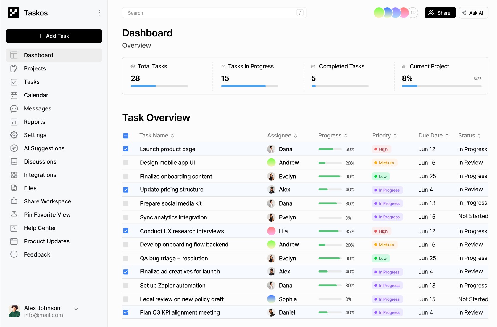
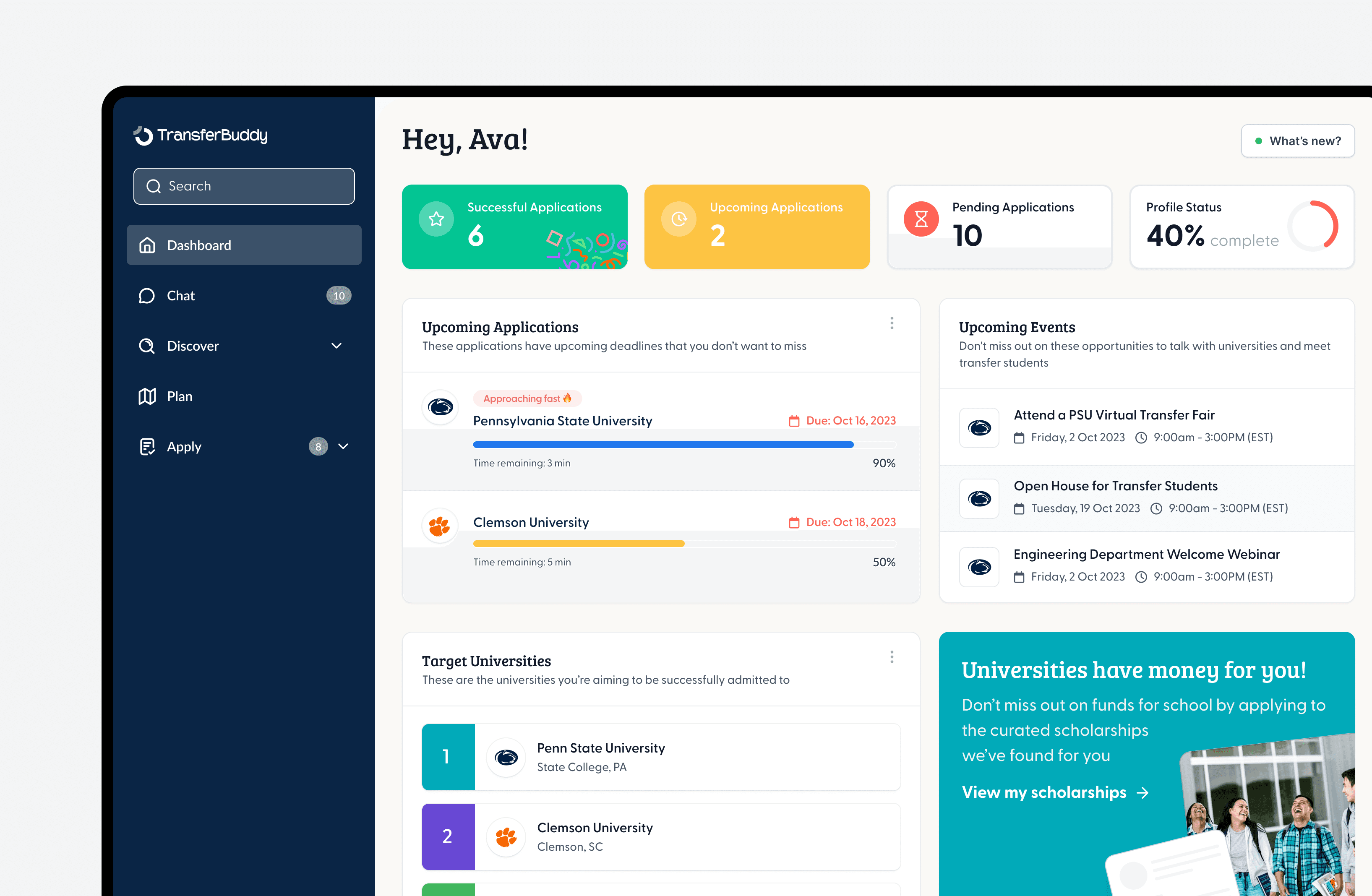
Student Dashboard
The Student Hub gave users an area where they could store and reference all of their activity on the app. They could also see their progress, important dates / deadlines, application status, and target universities.
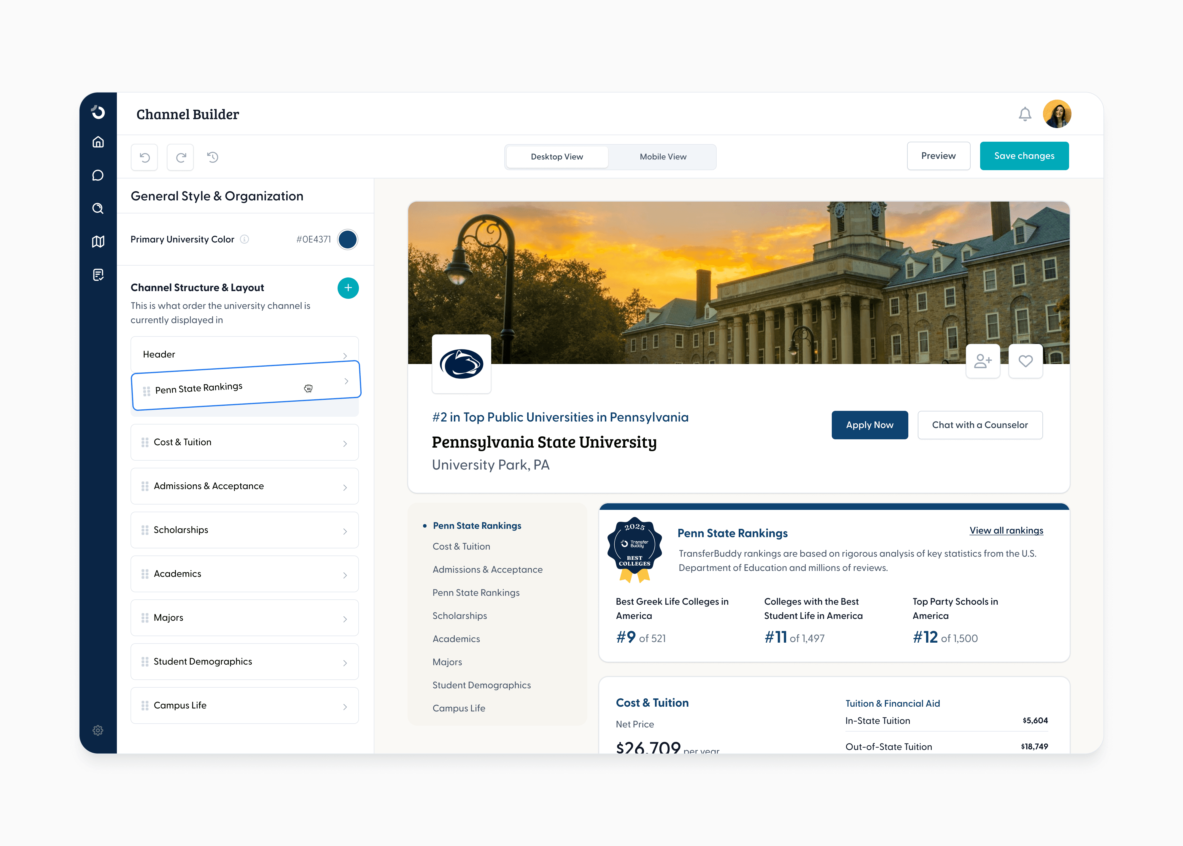
University Channel Builder
Branding is an important part to any university. To accommodate University's needs, we implemented a customizable "Channel" builder where the University can add their colors, logos, and specific sections.


University Channel Builder
Branding is an important part to any university. To accommodate University's needs, we implemented a customizable "Channel" builder where the University can add their colors, logos, and specific sections.


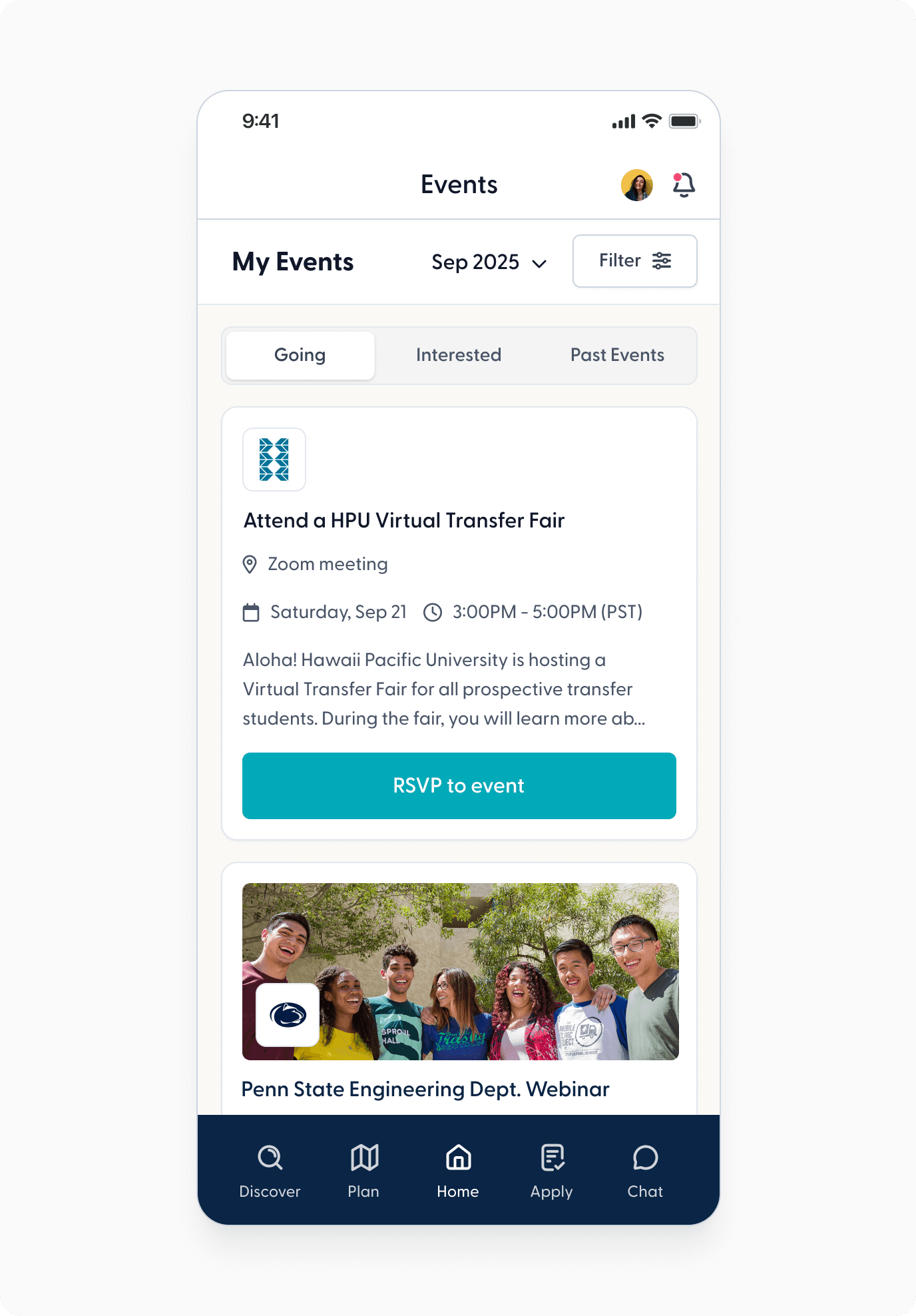
Explore Universities
I helped to create the first version of the “Explore" experience, where students can search for universities to find out more information such as group chats, programs, finances, majors, and upcoming events.


Multiple Rounds of Iterating
This project was a great example of how important iteration is in design. There were at least 6 rounds of iterations before the stakeholders considered the design to be in an MVP stage.
Mini-Design System for cohesive data display & future designs


"Alyssa is terrific to work with, friendly, and skilled in multiple areas of UX design and prototype development. It was a pleasure to work with her. She was able to meet aggressive deadlines and complete high-quality work on time."

Susan R.
Design Manager

I'd love to see if we're a match made in design heaven ✨ (we are)